What is real-time analytics for time series, and what do you do with it?
Let’s start with simple definitions. Time series data is largely what it sounds like – a stream of numerical data representing events that happen in sequence. One can analyze this data for any number of use cases, but here we will be focusing on two: forecasting and anomaly detection.
First, you can use time series data to extrapolate the future. Given the sequence “two, four, six, eight,” you can probably predict that the next digits will be “ten, twelve, fourteen” and so on. That’s the heart of time-series forecasting – numbers come in, and the patterns that they make inform a forecast that predicts which numbers will come next.
You can use time series data to detect anomalies as well. This isn’t very different from forecasting; anomaly detection forecasts the future and then looks for divergences. A simple example of this would be if you were to receive the sequence of data above. Based on what you know about the sequence, you’d expect it to go up steadily by twos. But what if you saw it start increasing by prime numbers instead? The primes would represent an anomaly.
When businesses receive accurate forecasts and can reliably detect anomalies, they’re able to make more informed decisions and prevent application errors that drain their revenue. When they can do this in real time, the advantages become even sharper.
Time Series Data for Business and Operational Monitoring
Businesses are operating increasingly complicated customer-facing and user-facing application environments. Most of these environments aren’t written in-house – they’re purchased from vendors and partners or copied from open-source libraries. In addition, development processes emphasize continuous releases of new code. All of this fosters an environment where breakages are both common and difficult to fix.
In an environment that serves millions of customers, even an outage that lasts just a few minutes can have ripple effects that tarnish the reputation of your organization. It’s best to catch outages before they happen. Fortunately, most outages provide signs that precede them – and it’s possible to catch these signs.
Companies can mitigate anomalies before they happen using real-time analytics for time series data. To do this, they need to understand three things.
Normal Behavior of Time Series Data
How does data look when it’s not currently undergoing an anomaly? If you understand this, then anomalies become easy to flag. At the outset, however, most data doesn’t look anything like normal – even when it’s acting normally.
For example, look at the chart below. Here you can see several kinds of data patterns, and none of them are presenting an anomaly as pictured. In the normal course of events, the signal from a metric can swing wildly.
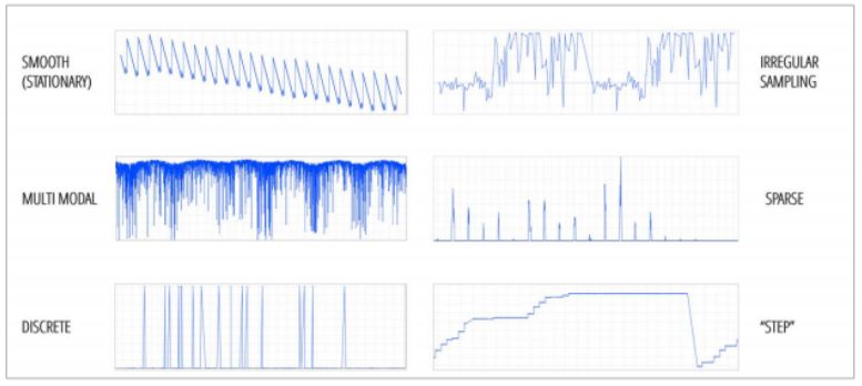
Instead of understanding this chart in terms of data points, it’s easier to consider the points as shapes with patterns. Each point makes a recognizable shape – a sawtooth, a square wave, a sine wave, and so on. When considering anomalies at scale, you can assign each metric a shape that matches its normal behavior. When the metric deviates from its shape, it’s experiencing an anomaly.
We should point out that this is a high-level explanation, and that there’s more than one way to understand the normal behavior of data. In addition, both this and other methods of understanding anomalous behavior are subject to two caveats.
- Data can exhibit seasonality. The best example here is a store during the weekday. It’s relatively empty from 9AM to 5PM, because everyone else is at work, but it becomes crowded afterwards. The increase in shoppers doesn’t mean that the store has suddenly become wildly successful – it’s just a reflection in data of how individuals behave. Analysts need to detect and compensate for seasonality before they can understand anomalies in a time series.
- Data patterns can change abruptly on their own. Continuing the example above, consider the difference between weekdays and weekends. All of a sudden, shoppers can come into the store any time they want, because most of them aren’t working on Saturday and Sunday. The signal from this metric completely changes for two days out of every week.
In order to fully understand anomalies within a set of time series metrics, data scientists need to understand what data looks like when it’s normal, while filtering out dramatic changes that can look anomalous but aren’t. In order to find these anomalies in real time, however, data scientists need to understand the behavior of anomalies themselves.
Understanding Anomalous Behavior
Let’s look back at our pattern-matching example. When we reduce time-series data to a series of patterns, it becomes easy to see anomalies where they occur. For example, it’s easy to see that the pattern below contains several spikes that are well above the normal variance for the metric that’s being recorded.
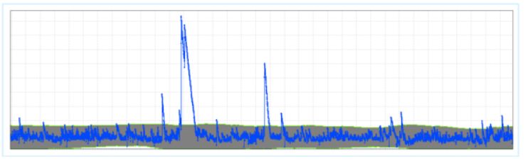
Not every anomaly is significant – and some anomalies vary in significance based on the metric that is being measured. Anomalies are categorized based on their duration and their deviation. Duration refers to how long the anomaly lasts, and deviation refers to the extent to which the anomaly differs from the normal behavior of the metric. The tallest spike in the figure above has an extremely large deviation. It also has a relatively long duration based on the other two spikes.
The three largest spikes in the time series are probably worth investigating no matter which metric is being measured. On the other hand, there are several smaller spikes of short duration. Are these concerning?
To a certain extent, the truth rests on what you’re measuring. Any anomaly that has to do with a core metric like revenue, for example, is probably worth investigating. For other metrics – website visitors from regions where you don’t do a lot of business, for instance – you most likely need to focus only on anomalies that exceed a certain threshold.
There’s an exception to this, however – a small anomaly in a less-important metric might suggest a large anomaly in a mission-critical metric.
Correlating Anomalies Across Different Metrics
Outages tend not to occur in a vacuum. A single outage will most likely be related to two or more different anomalies. Understanding how these anomalies occur together makes it easy to understand where the cause of the anomaly originates and how to fix it before it results in unplanned downtime, price glitches or abandoned shopping carts.
It’s possible to correlate anomalies based on both normal and abnormal behavior. Metrics that are related will likely be affected at the same time by similar anomalies. To find related metrics, you can look at their normal behavior – if their patterns are the same at the same time, then they’re probably related and an anomaly that affects one will most likely affect the other.
On the other hand, metrics with different patterns can also be related. One can find these by looking for apparently unrelated metrics that experience anomalies at the same time. These anomalies are harder to parse, because in an environment with millions of metrics, it’s likely that several unrelated metrics are simultaneously experiencing anomalies. The key here is to look for repetition – a pair or group of metrics that experience anomalies at the same time several times in a row are very likely to be related.
When an anomaly detection system can determine that multiple anomalies in time series data are related to the same issue, it lends itself to a property known as “conciseness.” It means that an analyst reading a report will only take a short amount of time before connecting the dots and understanding what’s about to break. For example, a series of related alerts might highlight that:
- There’s an abnormal amount of web traffic
- There’s an abnormal amount of bad requests
- Average latency is increasing
These metrics, when viewed at a glance, reveal an ongoing DDoS attack.
Real-time anomaly detection for time series helps companies pivot before outages and other glitches can affect their customers and workers. Unplanned downtime is just one example of a crisis averted. eCommerce companies can use anomaly detection to find and fix pricing errors that can cause their customers to over (or under) pay. Marketers can combine anomaly detection with social listening to find the latest trend. Engineers can use network sensors to find anomalies in capital equipment and perform proactive maintenance.
Using a different form of analytics, however, one can make decisions not just from moment to moment, but for years into the future.
Time Series Forecasting
Like any company, you are generating a large amount of data every second. Each metric that you store data for is valuable, and you can use this warehouse of data to help you make forecasts about the future.
Extrapolation is one of the first and simplest forms of statistical analysis – but remember that most metrics don’t lend themselves to easy extrapolation. Patterns change. Seasonality occurs. Once you understand what the patterns are and what seasonality is, you’ll be able to create a more accurate forecast. You’ll know what the ebbs and flows of your business look like over the short term, and you can filter these out to understand your growth in the long term.
Once you do this, however, you’ll find yourself in a position to meet your customers’ needs before their desires turn into impulses. Ridesharing companies can put enough cars on the road to accommodate the demands of their passengers. E-commerce companies can order enough inventory to satisfy the needs of their customers. IT administrators can provision enough infrastructure to support increased demands on the corporate website.
If you’re starting from zero, the capabilities of real-time analytics for time series data can seem like magic. Fortunately, you can already begin laying the groundwork for real-time analytics. Here’s how to start implementing real-time analytics in your own workplace.
Implementing a Real-Time Analytics System for Time Series
It all starts with data. Companies collect reams of data, but less than 30 percent of data is ever analyzed.. Building real-time analytics for time series means running most or all of this data through your analytics tool as fast as it comes in.
Data I/O
The real problem with data analytics is that most data isn’t optimized for analysis. If you want to run analytics on a social listening program, for example, you’ll find that tweets and hashtags don’t natively convert into time series data. 80 percent of all data is unstructured, and it needs to be converted into a digestible format prior to analysis.
Building an analytics capacity, therefore, requires three foundational steps:
- Data Sourcing: Finding the sources of data that you’ll use to conduct analytics. If it’s your website, you’ll be using your CMS. If it’s sales data, you’ll use your CRM. If it’s security data, you may use your SIEM.
- Data Pipeline: Once you’ve identified your sources, your next step is to transform them into a format that’s suitable for analytics. Some of your raw data might be in a format that’s immediately digestible by an analytics tool. The rest will have to go through an extract, transform, and load (ETL) process. Hopefully, you’ll be able to extract application data using built-in API tools; otherwise you’ll have to build your own.
- Data Warehouse: Not all analytics tools work in real time. With many, you can expect a certain amount of lag – a delay between receiving the data in an analytics format and being able to process it. The data warehouse is where your analytics data sits until it can be processed.
Once the data is sourced, transformed and waiting in its warehouse, you have two choices: analyze the data using existing manual methods or by using next-generation artificial intelligence.
Manual Analytics
Let’s just come right out and say it: manual analytics has few, if any, advantages when compared to newer methods involving AI and machine learning. Primarily, detailed manual analytics can’t be performed in real time. Some manual analytics can be presented in real time, but the resulting data usually isn’t detailed enough to be actionable.
A lot of manual analytics involves data visualization – essentially throwing a few time series charts onto a collection of monitors. Analysts can see the metrics going up and down in real time, but an analyst isn’t going to be able to pay attention to as many metrics as they truly need to monitor. An enterprise can potentially monitor thousands or even millions of metrics. Detecting anomalies means monitoring all of them. Creating an accurate forecast means understanding the ways in which these metrics affect one another.
Analysts are able to do this with manual methods to a certain extent. It takes a long time to process an individual data warehouse or cluster of metrics as a single chunk. A process called “slicing and dicing” reduces this data into more manageable portions. For example, instead of performing the forecast for the entire United States, an analyst can create forecasts for Boston, Chicago, New York, and other large cities. Although this method is faster, it lacks accuracy.
AI Anomaly Detection
Earlier, we talked about some of the methods that forecasters use to detect anomalies. As it turns out, these methods scale when used in a machine learning context. Remember the example we used with the spikes in the chart – compiling the patterns that your metrics create for a library of archetypal shapes, and then throwing alerts when those shapes begin to change? This is an ideal use case for artificial intelligence. Machine learning software can both create the library of shapes and then match these shapes to various metrics.
The advantage of artificial intelligence in this instance is that it can monitor millions of metrics simultaneously and then react immediately when a metric begins to change or throw up anomalies. There’s no slicing and dicing in artificial intelligence – AI gives you the entire picture, and automatically highlights the most interesting (or serious) anomalies that you need to look at.
For example, think back to July 2019, when Target suffered two massive POS outages over Father’s Day weekend. For over three hours during what was projected to be a $16 billion shopping event, customers in Target stores were unable to complete their purchases – leading to a potential $100 million loss in sales.
Big outages like this don’t happen on their own, and they’re usually due to multiple overlapping failures as opposed to a single cause. Somewhere, a server goes down. A bad patch breaks application dependencies. An overload of activity causes a network to fail. Enough of these things happen together and the whole Jenga tower falls over.
Most of this activity is foreshadowed throughout the network and the e-commerce environment – which is where AI-assisted anomaly detection comes into its own. This solution would have the ability to alert on a cluster of related metrics that were all showing anomalies at the same time. Analysts would be able to notice the problem instantly, understand the source of the problem, and then trace the problem to a single event – making it that much easier to fix.
AI Forecasting
In terms of forecasting, AI provides similar benefits. Manual forecasting methods cannot scale to incorporate the number of metrics needed to create an accurate forecast. Thousands of seemingly miniscule factors influence future events. If you don’t account for them, your forecast will likely experience wide margins of error.
No manual methods can account for this scale of influencing metrics. AI, on the other hand, can produce continuous forecasts. If you need a forecast for what’s going to happen next week, tomorrow or an hour from now, you don’t need to wait – the forecast is already there. Instead of using input from just a few metrics for the sake of speed, AI can ingest every metric you measure. It becomes more accurate the more data it has.
The biggest advantage of AI is that it can account for thousands of influencing metrics (for example, what sales were like during last year’s Cyber Monday), and measurements (for example, weather or stock market). It can also account for historical data – to determine a forecast, which leads to more accurate results. A human can only account for a handful.
Organizations like the UK’s National Grid have begun to incorporate AI forecasting into their clean energy portfolios in order to understand how much energy they’ll be able to produce from solar power every day. Here, AI demonstrates its advantage by producing a fast forecast using more variables – one forecast a day, and 80 metrics as opposed to just two. The organization has already increased its forecast accuracy by 33 percent.
Creating real-time analytics for time series may seem like a long journey, but it’s one that’s worth doing. Organizations that use these methods are already beginning to demonstrate competitive advantages that are heads and shoulders above their peers, and the gap between them will only get larger as time goes on. When you start building time-series analytics, you’ll be building an opportunity to recapture lost revenue, prevent loyal customers from churning, and meet the needs of your customers before they even know what their needs are. Start building your analytics capability now – request an Anodot demo to get started.